getting started with google os (chromium) – a step by step guide

I installed Google OS (Chromium really) in a virtual machine to try it out.  It really is as simple as advertised.  Here’s everything you have to do.

The first time you use the computer

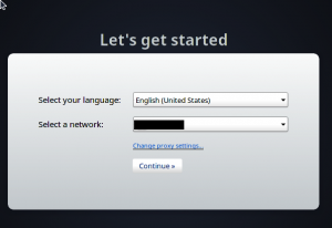
  1. Tell the machine how to connect to the internet.  It was ethernet rather than wifi.  Presumably because the VM is networked to the host machine.
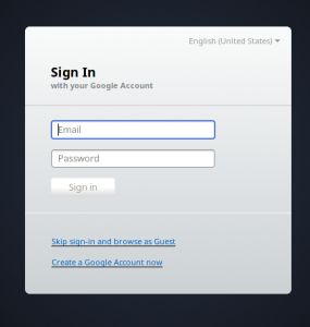
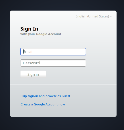
  2. Username/password for google account if have one.
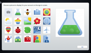
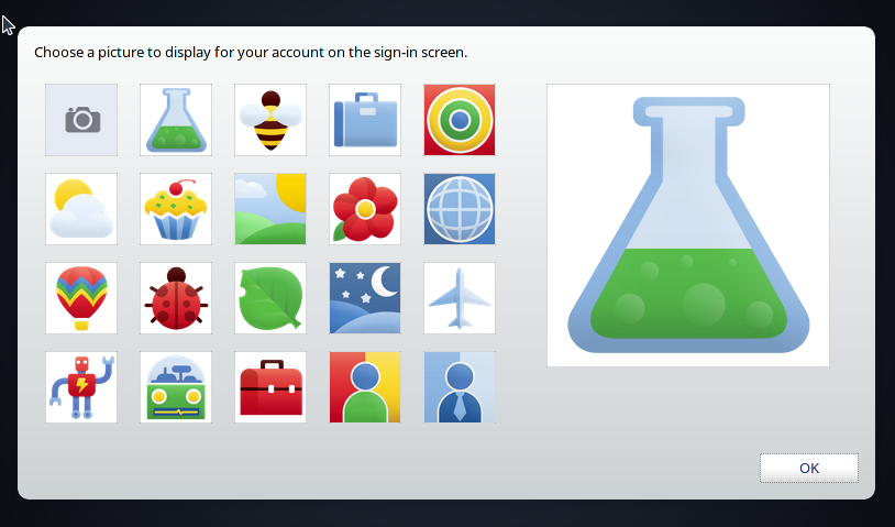
  3. Image you’d like to use for identification.
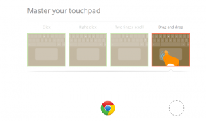
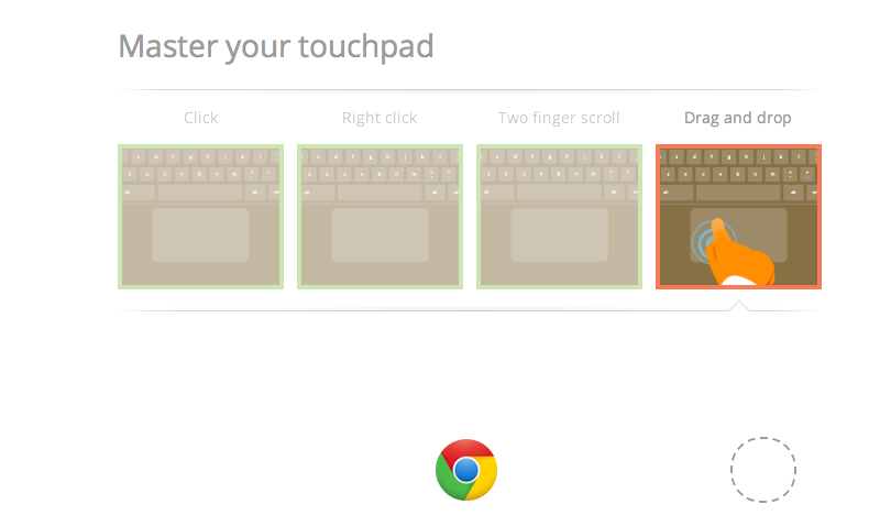
  4. Practice with your touchpad.  You can see this online.  It’s pretty cool in that it picks up on the fact that I have a smart touchpad.    In my Safari browser on the host machine, I can drag and drop and the like.  In my Chrome browser on the guest, I cannot.  Both the laptop and external trackpads work fine in the Chrome browser on guest; it’s just the test page giving me problems.
  5. Usability issue: It took me about five minutes to realize that was it.  It’s a normal browser window from which yo can go to other websites.

The menu

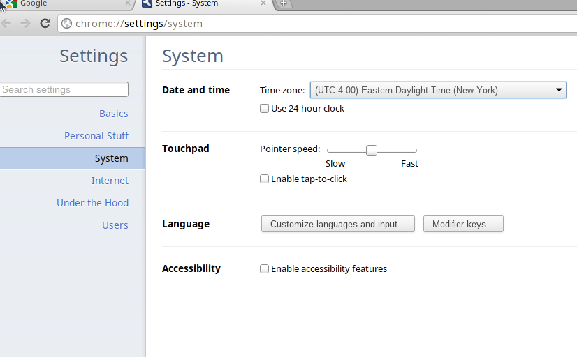
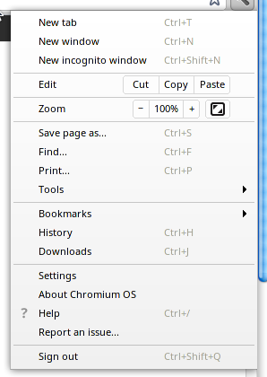
Click time and “open date and time options” to get the control panel lite.  This is where you can say you don’t want passwords saved, set up security and other preferences.  You can also get here by clicking the wrench on the right side of the screen.

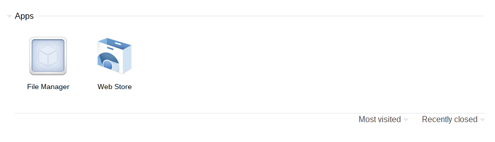
If you close the browser, you get the bookmarks bar.  It starts with an option to take you to the webstore which offers both free and paid apps.  You mean you didn’t want to play Angry Birds?  The other built in option is the file manager which appears to host local and cloud storage.  I was puzzled because I thought there was no local storage.

There options for the browser are easy to read.

The second login

It shows your cute icon/avatar.  It took about 15 seconds to launch.  I’m not sure how much of that is Chromium and how much is me launching a computer within my computer.  (For the more technical folks reading this, I imagine starting a real computer is going to be about the same or a little slower.)

eclipse 3.7 on the new mac – 8 good features & 1 bad + my plugin list

I downloaded Eclipse 3.7/Indigo release.  Since I got my Mac so recently, I waited to install development tools and create a new Mac workspace until Indigo came out.  My first set of installs on a Mac had some extra unexpected surprises of course.  Installing Postgres didn’t go nearly as smoothly as Eclipse.  Check back for the blog post on that!

Downloading

I went with the JavaEE developer release since it has web functionality built in.  I confirmed I had a 64 bit machine by running uname -a.  I also finally realized the clue that I’ve clicked download.  It’s that the download icon turns into a progress icon or changes the icon to my most recent download.

Installing

When I selected the download, it automatically unzipped it to downloads.  I then dragged it to the applications folder and added Eclipse to the dock as described.  Somehow I downloaded Helios instead of Indigo and had to do it again.  Not sure how that happened since I downloaded on Indigo release day.  I’ll assume I was tired.

Eclipse itself

My plugin install list contains what I used in Eclipse 3.6 plus a number of others.  This time I used Marketplace Client to try to get the plugins.  It’s nice that you can browse plugins and get ideas for things to install that you didn’t know about.  It’s not much easier to install, but it wasn’t exactly hard before.

Plugin Purpose Marketplace Experience
Sysdeo Tomcat integration Listed, but no install link. Still must install by unzipping into plugins directory.
EclEmma Code Coverage Smooth – click and install
PMD Static analysis Listed, but no install link. Had to use install site link directly.
Subversive To access Subversion repositories Smooth – click and install
eGit To access Git repositories (or run your own locally) Smooth – click and install
Hibernate Tools JPA assistance Did not install. There was a conflict with the built into JPA perspective in the JEE version of Eclipse. While I usually hand create my entities, I like having the plugin available but this isn’t a big deal.  The built into one appears to do the same thing.  And more likely, I wouldn’t use them either.
Groovy Groovy project/editor and console Couldn’t find in Marketplace, but think it is there.  Installed from install site link.
Freemarker IDE Freemarker syntax highlighting and macro assistance. Didn’t look in Marketplace.  I didn’t know this existed, but JBoss supplies it at the same URL as Hibernate Tools and I found it by accident.  Since JForum (CodeRanch) uses Freemarker, this could be helpful.  Trying it for five minutes, the syntax highlighting made the install worth it.
m2Eclipse Maven Smooth – click and install

What I like

In Eclipse 3.6, there were only 4 features I liked enough to remark upon.  This time, there are twice as many!

  1. A few versions of Eclipse ago if you had m.method(one, two) and tried to delete the “method” followed by autocomplete, it left the parenthesis and parameters alone.  Since at least Eclipse 3.5, it would add an extra set of parens and parameter templates.  Horribly annoying.  In Eclipse 3.7, it goes back to the original behavior.  Very excited about this fix!  This wasn’t reproducable, I think it was luck.
  2. JPA annotation autocomplete got better.  This is a minor convenience.
  3. Secure storage – passwords are now stored encrypted on disk.   This does mean anyone who uses your computer/account can commit on your behalf.  Not a problem on my home computer.
  4. “Document proxy icons in Cocoa” – you can drag an icon in the title bar to another application.  Sounds like it has potential.
  5. You can open the same file in different editors at the same time.  This is nice because I sometimes like to be in the visual and XML views.
  6. Being able to filter the compiler settings preferences.  (That list has grown so long it is hard to find specific options.)
  7. Compiler setting to ignore unavoidable generics problems (when calling legacy code.)  This is nice because it avoids false positives.  There is a risk because you have to be extra careful in that space, but I’ll find that in unit test.
  8. Paste URL into JUnit view – useful for loading an Ant or Maven junit report XML file from a nightly build.

And my worst feature

  1. The extract method keyboard shortcut is gone!  I use this one a lot.  It was there on Mac Eclipse 3.6.   You can still use the menus, but that is less efficient.

Mac Stuff

Since I had downloaded Eclipse 3.6 for the Mac, I installed it as well to see what was a Mac issue and what was an Eclipse 3.7 issue.  Here’s what is not new in Eclipse 3.7, but was new to me.

  1. In Safari, control left/right arrow take you the beginning/end of the line.  Which is convenient because shift + control + arrow highlights the line.   (I learned today that the command/apple key does the same as control although it is more awkward to type.)  In Eclipse, command left/right arrows takes you to the beginning/end of the line but control does not. Luckily, command + arrow does work in Safari so I’ll be using that shortcut now.  (It would be nice if there was a standard across applications for this – pgadmin doesn’t work the same way as either of these and I haven’t found the keyboard shortcut there yet.)
  2. My integration tests went down from three minutes to seven seconds!  This isn’t a Mac thing – it’s a six year old machine vs brand new machine.  But still cool.  I didn’t know they could run so fast.
  3. I changed the Mac system preferences to turn on “Use all F1, F2, etc keys as standard function keys”.  Having to press “fn” to use the debugger was quite annoying. I use the special keys a lot less than the function keys overall.  And when I am changing the sound volume, I’m not in the middle of typing/debugging.  I wish I could change it on only one of my two keyboards.  (I’m using a standalone keyboard where I care about the function keys being reversed.)  Not important, but it would be cool if I could switch to use the built in keyboard without the function key.

Bait and Switch in the AppStore

As Barney Stinson from How I Met Your Mother once pointed out, “New Is Always Better”, but does this principle hold true for free application updates on Apple’s AppStore? This article delves into the alarming practices of “bait and switch” by some application developers on the AppStore, as well as how this situation will be exacerbated by Apple’s upcoming iOS 5 release.

I. The Past

As an early iPhone/iPad adopter, I used to get excited when application developers released an update, because I knew it meant an expanded set of features, bug fixes, or for games, new levels. It was a pleasant surprise and often done as a “Thank You” do those that made the app a success. Updates from Epic Games’s popular Infinity Blade, for example, included a great deal of new content, levels, and multiplayer features, all free to those who already purchased the game. Others, from the developers of RedLaser included lots of new features and options that expanded the usefulness of the application far beyond the initial version.

II. The Present

The first time I ever experienced “Buyer’s Remorse” after updating an application on my iPhone was when I downloaded a Lightsaber update, after Lucas’s legal team had intervened in the original, unlicensed app. They took what was a simple and fun application and added tons of advertisements, popups, and ultimately reduced the “fun” of the application to a giant commercial. As good developers should know, simple is often better. Another good example of advertising gone wrong is when I updated my originally-free Newton’s Cradle app, which now includes an advertisement for a movie directly on the icon for the application.

A couple of disappointing updates later, I discovered my first instance of “bait and switch” on the AppStore when I updated U Connect, a simple connect-the-dots styled game. As soon as I launched the new version I discovered that pop-up advertisements had been added to the “paid” version of this game. The confusing part is that there is already a paid (full) and free (lite) version of this game, but the developers have decided to add advertisements to both versions, which up until now has been uncommon for apps in the AppStore.

The scary part is there is no way to revert to an older version of the app. Even if you paid the for app, you are stuck with the most recently downloaded version. On top of that, Apple has refused to add a “Skip” or “Ignore” button for updates that lets you indefinitely postpone updates for a particularly troublesome application. Keeping track of what applications to not update creates more cumbersome problems. For example, if there are ten updates out this week and there is one you do not wish to update, you cannot use the “Update All” button, but instead must select each of the other nine applications individually, now as well as for all future updates. This is both time consuming and frustrating and makes for a terrible iOS user experience.

These days I just delete an application if the update adds unwanted ‘features’ – but when it’s an application I’ve paid for, I’m especially disappointed and feel taken advantage of.

III. The Future

As Apple prepares to release iOS 5, with a strong emphasis on over-the-air updates as well as PC Free support, I am concerned this issue is going to grow more out of control. If the rumors of Automatic Download are true, then app developers will be free to push new, more advertising-heavy applications to your iOS device without even letting you know. I’m concerned the life cycle of AppStore applications might evolve such that, as applications age past their initial user base, the only new feature is an increased amount of advertising.

Where do we go from here?

Normally, I would say managing application updates is out of Apple’s control but their screening and approval process for new applications is so involved, perhaps they should exert some efforts to reviewing updates for existing applications. Whether or not they have the right to tell an application developer that their paid application is not allowed to have advertisements is up for debate, but something needs to be done to stem the tide of alarming application updates. For me, I would like a “Skip” button that lets me ignore updates for apps that I have identified as problematic, so I can mark it once and forget about it and/or a way to downgrade to older versions of an application. Ultimately, this is a quality control issue that Apple needs to address and in lieu of that, they should give iOS users a chance to take control of the issue.