Most people familiar with my UI work know I’m all about preserving screen real estate. In other words, I like to design the most streamlined interface with as few unnecessary buttons and glitter as possible. Why do I need a pretty graphic taking up 1/4 of my screen when I could using it for something else?
I all ready had my doubts about Facebook’s current ad system which included such user-requested buttons as “More Ads” as shown below:
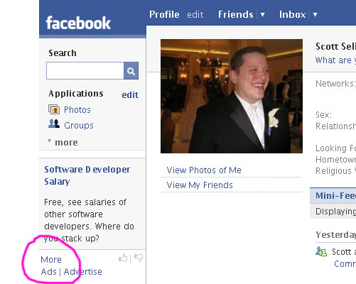
Talk about a waste of space, can’t imagine why anyone would click on the button. That’s like a person requesting more commercials while watching TV.
But the genius development/marketing team from Facebook have done it again. Yes, from the makers of such buttons as “More Ads” I give you the redesigned (currently optional) Facebook interface:
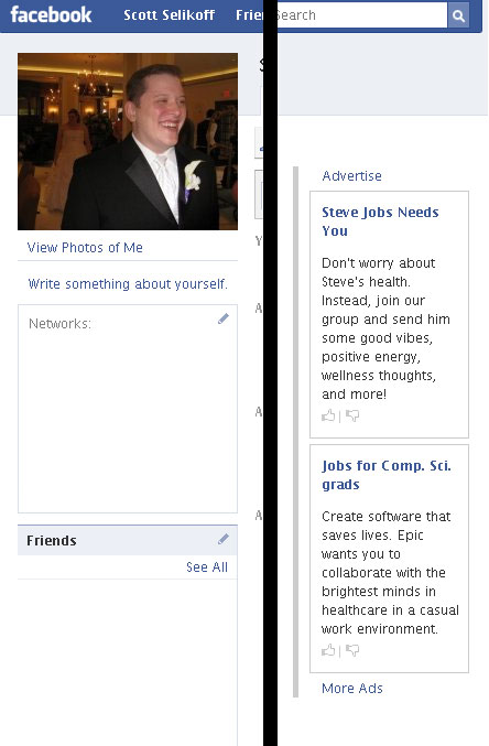
I’ve cut out the middle and obfuscated it a tad (if you don’t know the meaning of the word ‘obfuscate’ and you’re a developer, go look it up, you should). Notice it now has much larger ads, that instead of being integrated into your profile stick out a lot more with nothing above/blow them. Also, there are two by default instead one! This *new* more wonderful interface may worry some people that Microsoft’s acquisition of Facebook is beginning to show, but don’t worry, the “More Ads” button has not been lost!